SCHEDULE A FREE CALL TO TALK ABOUT YOUR PROJECT

SEREIN

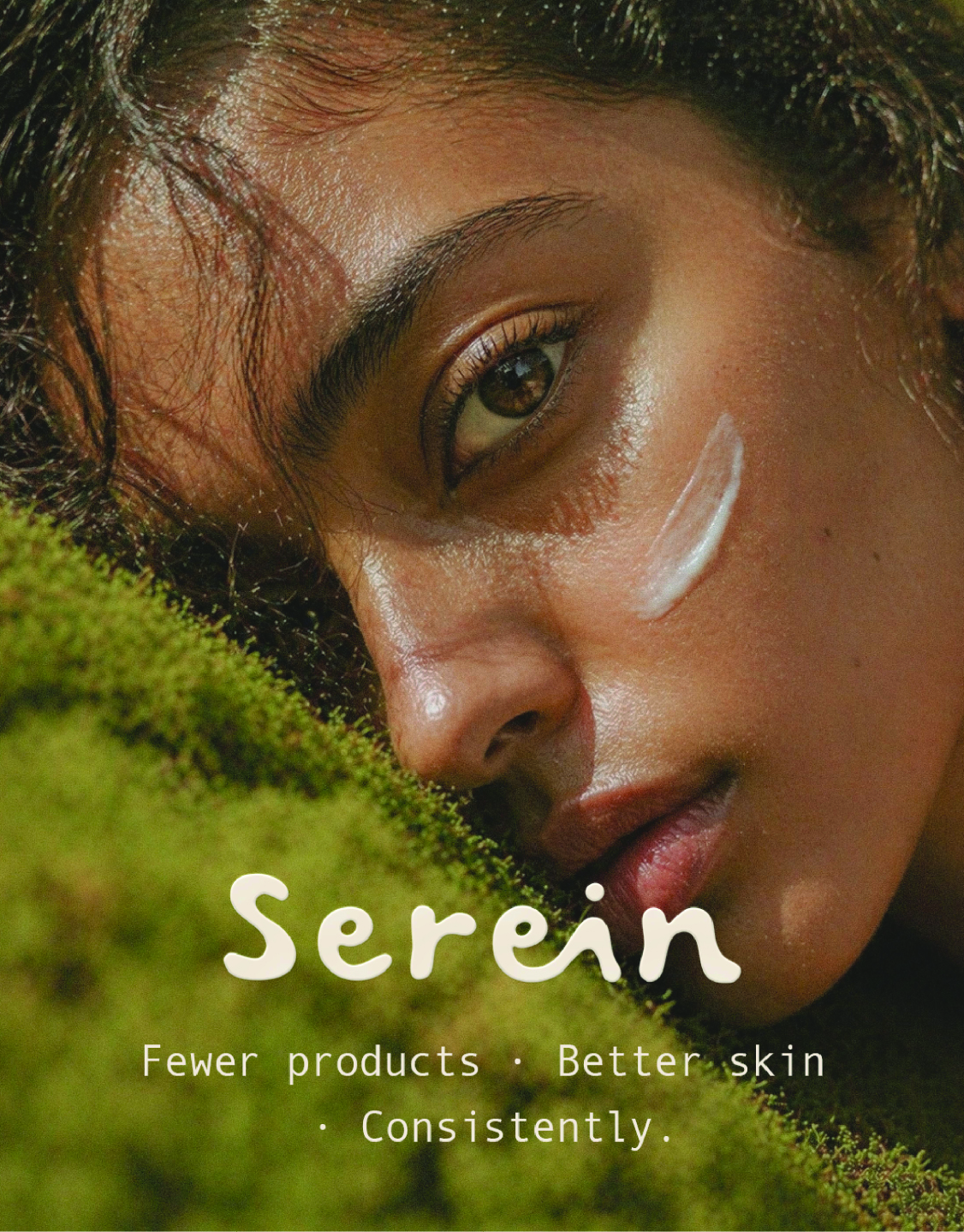
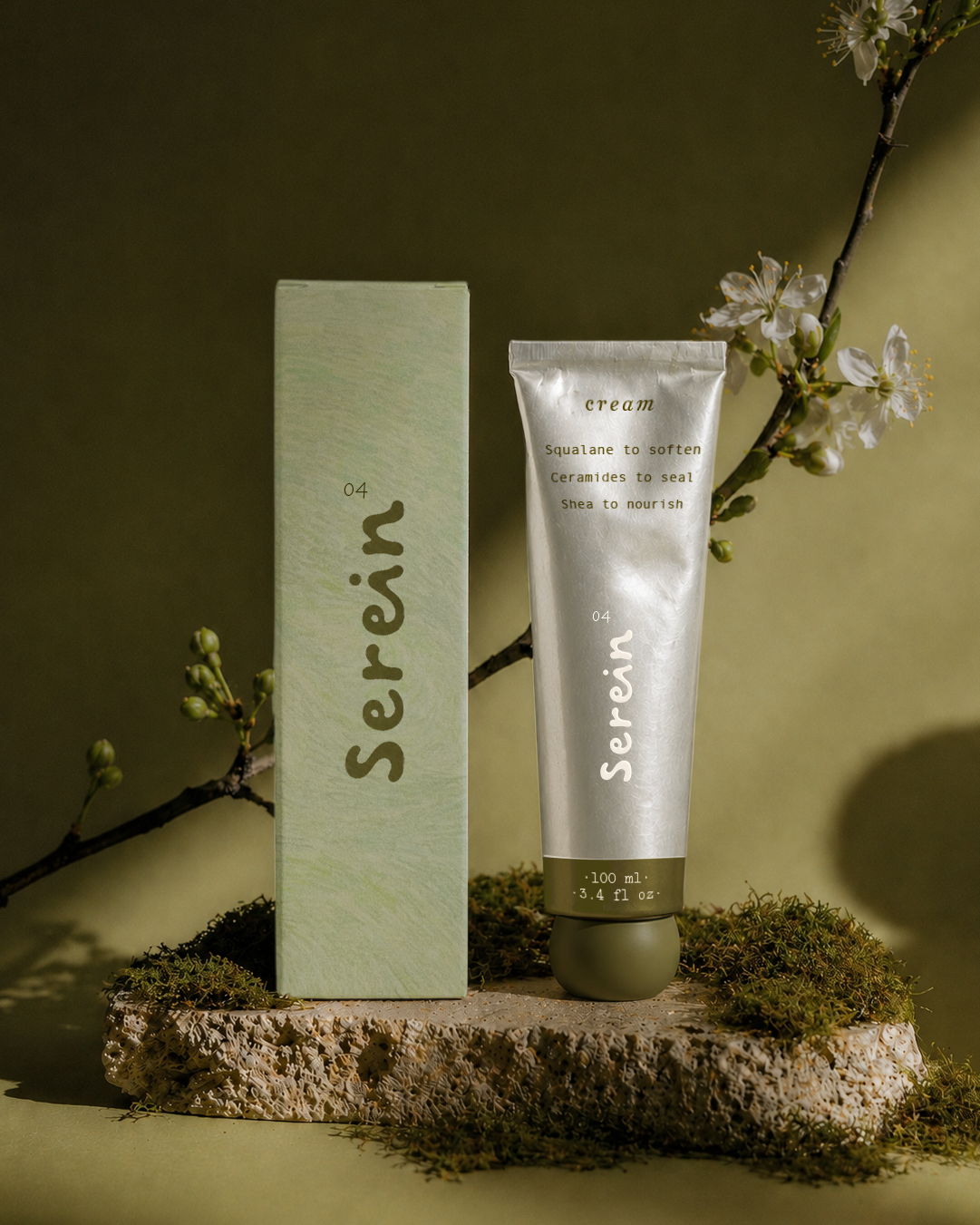
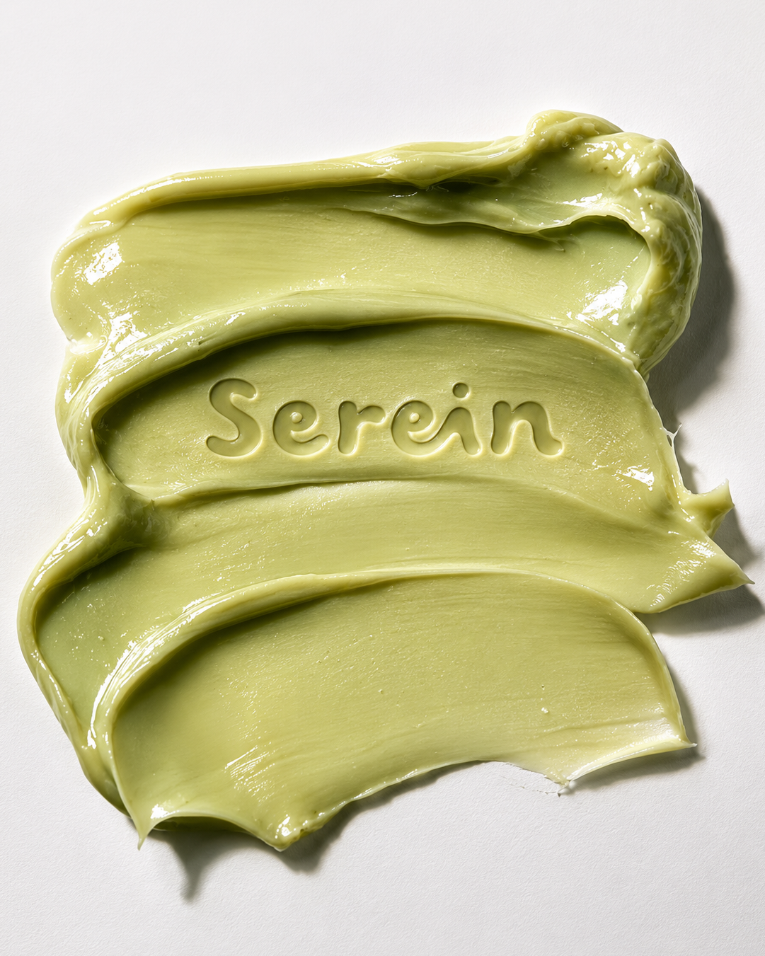
A conceptual skincare brand exploring a slower, more intentional approach to beauty. Serein translates calm, consistency, and sensorial texture into a grounded, tactile visual identity.

The BRIEF

Serein is a conceptual skincare brand exploring a slower, more intentional approach to beauty.

Built around the idea that consistency matters more than intensity, the project translates emotional clarity into a tactile, grounded visual identity. The goal was to create a brand that feels calm, honest, and sensorial, where texture, light, and materiality become part of the storytelling.

From packaging to campaign visuals, every element was designed to feel real, soft, and quietly luxurious.

Colors

A muted palette of earthy greens and warm neutrals inspired by skin, plants, and natural light. Soft contrasts and desaturated tones create a calm, grounded, and quietly premium feel.

The challenge

The skincare space is saturated with two extremes: overly clinical, sterile brands or overly aesthetic, trend-driven visuals The challenge was to create something that sits in between: emotionally warm but still refined, minimal without feeling empty and natural without feeling generic. The brand needed to feel like a ritual, not just a product.

Design approach

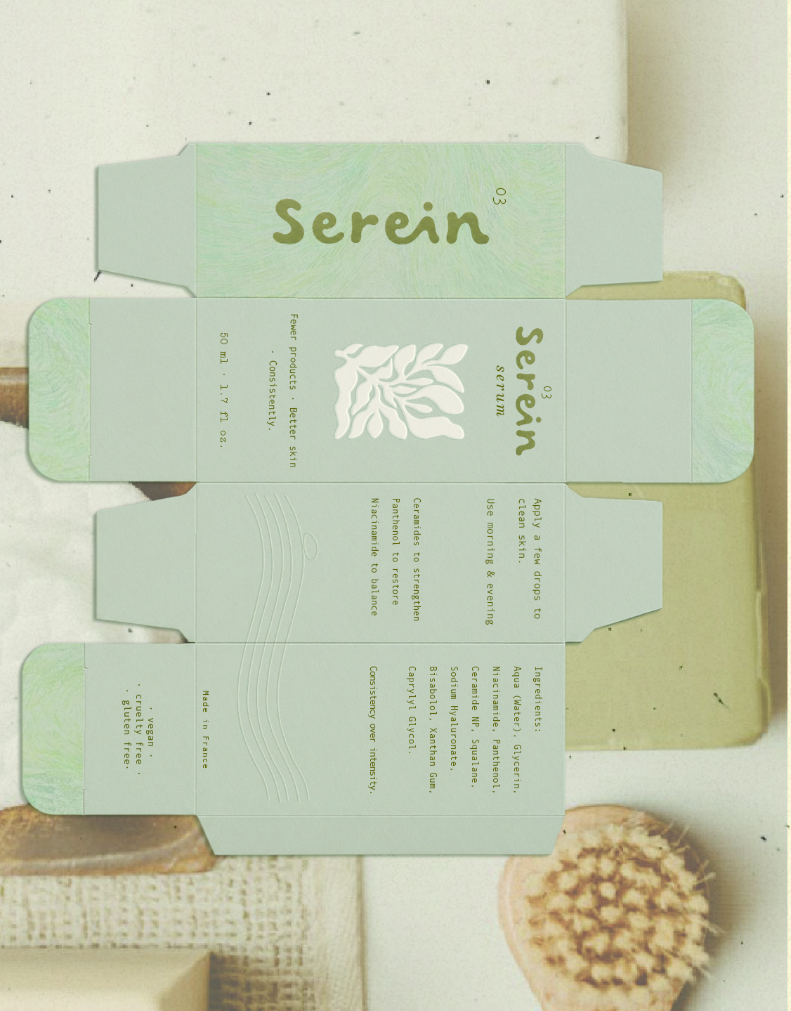
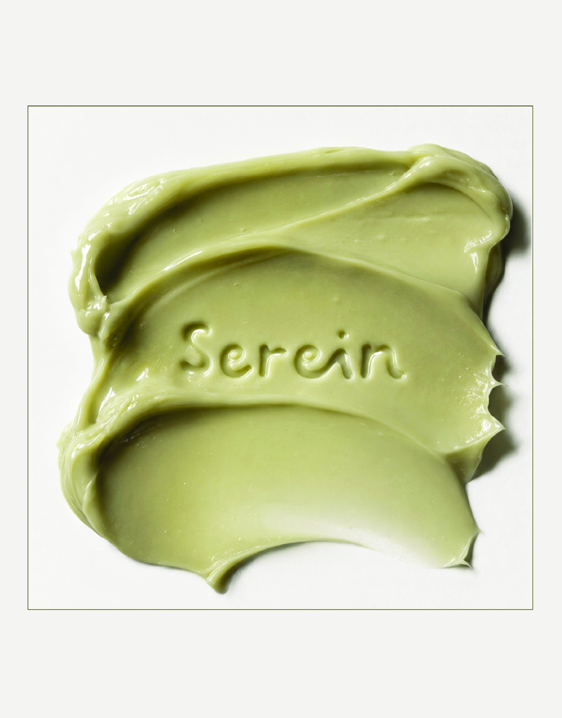
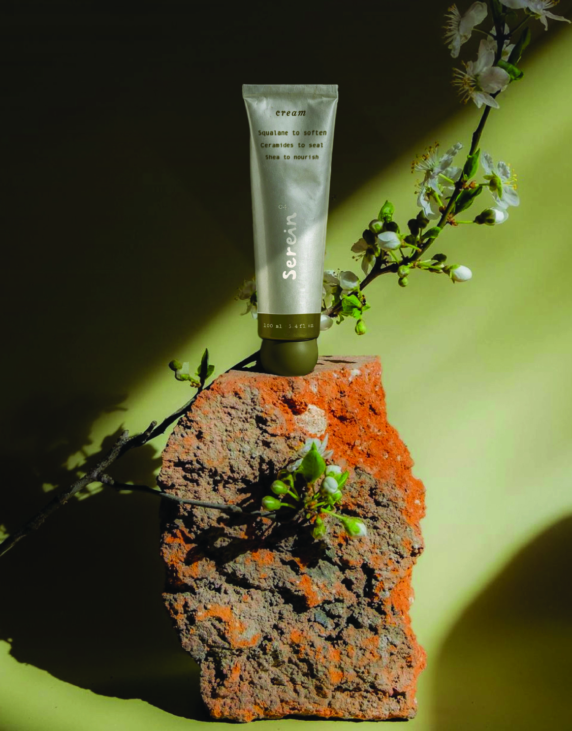
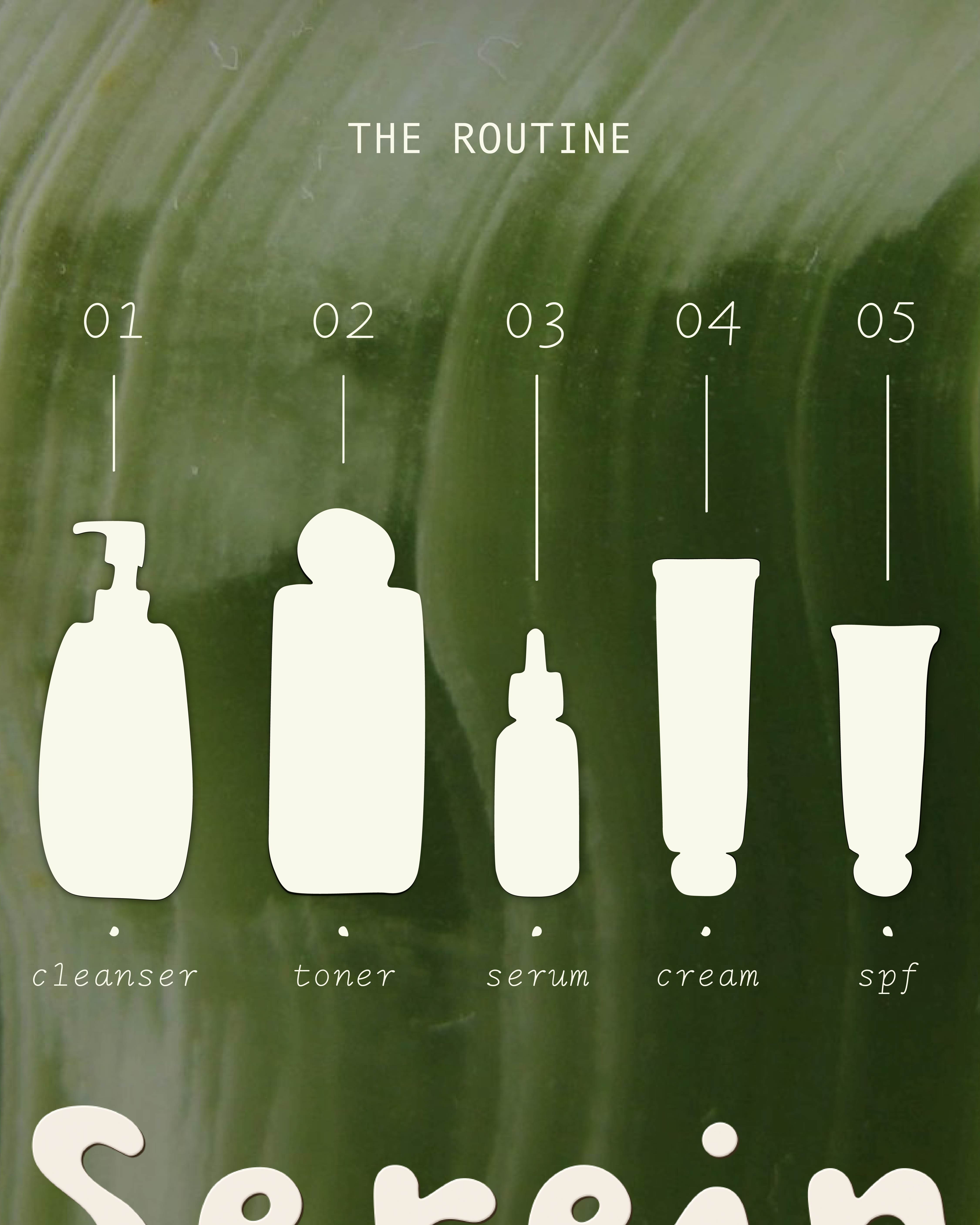
The direction focused on materiality and integration.

Instead of treating branding as something applied on top, the goal was to make it feel embedded into the object itself.

  • Labels were designed to feel like part of the paper, not stickers
  • Typography was softened and slightly imperfect to feel human
  • Textures (paper, grain, light) were used to create depth and realism
  • Product visuals were grounded in natural elements, stone, plants, skin

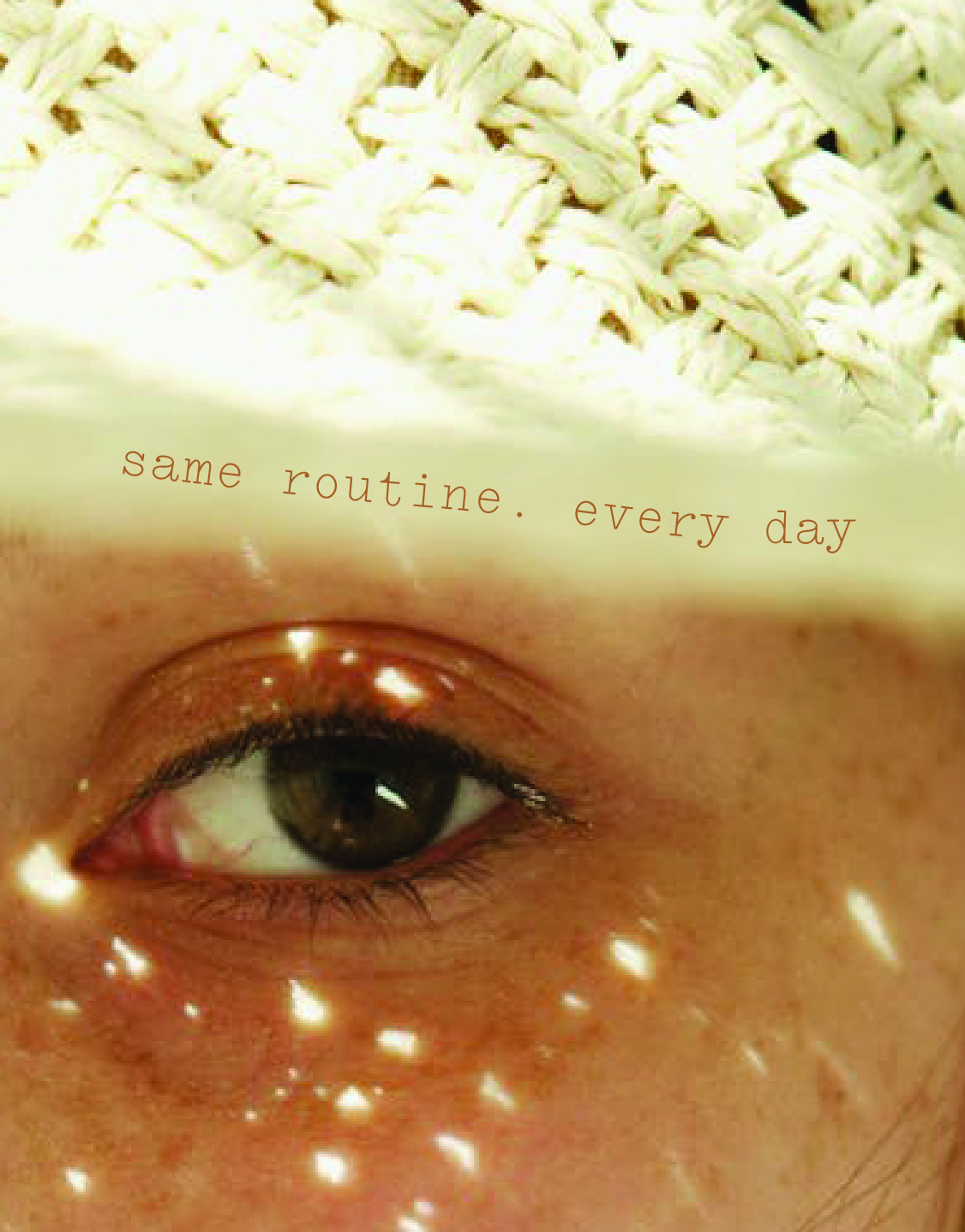
The campaign extends this approach by placing the product within tactile, organic environments, reinforcing a sense of calm and presence.

No items found.
See what else is blooming →