A serene and nature-driven identity inviting reconnection, movement, and a deeper sense of presence within the body.
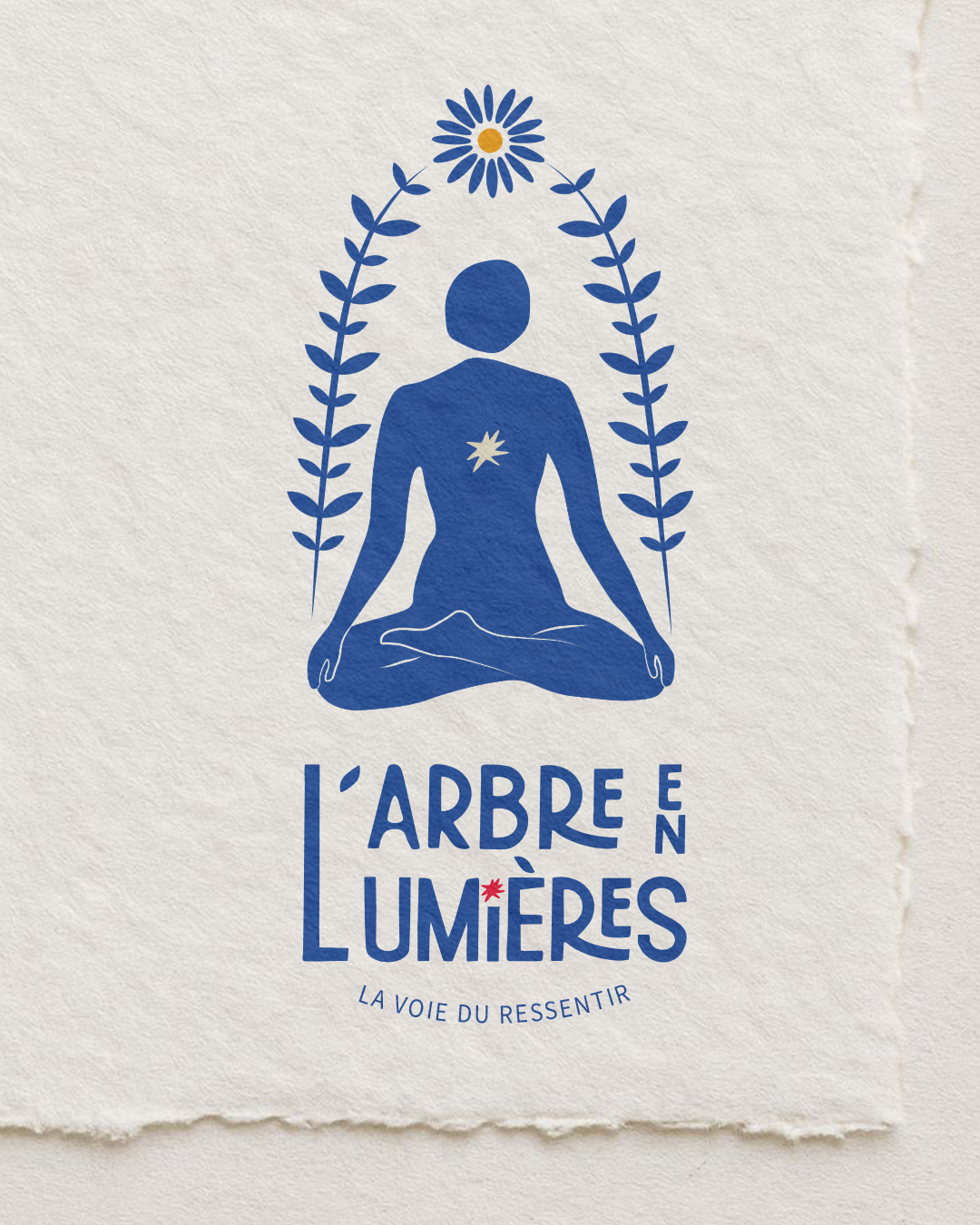
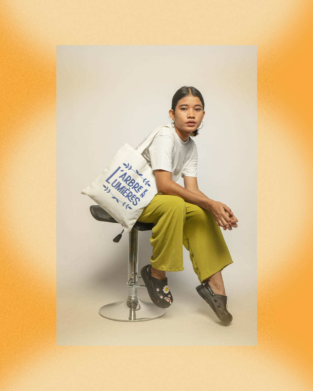
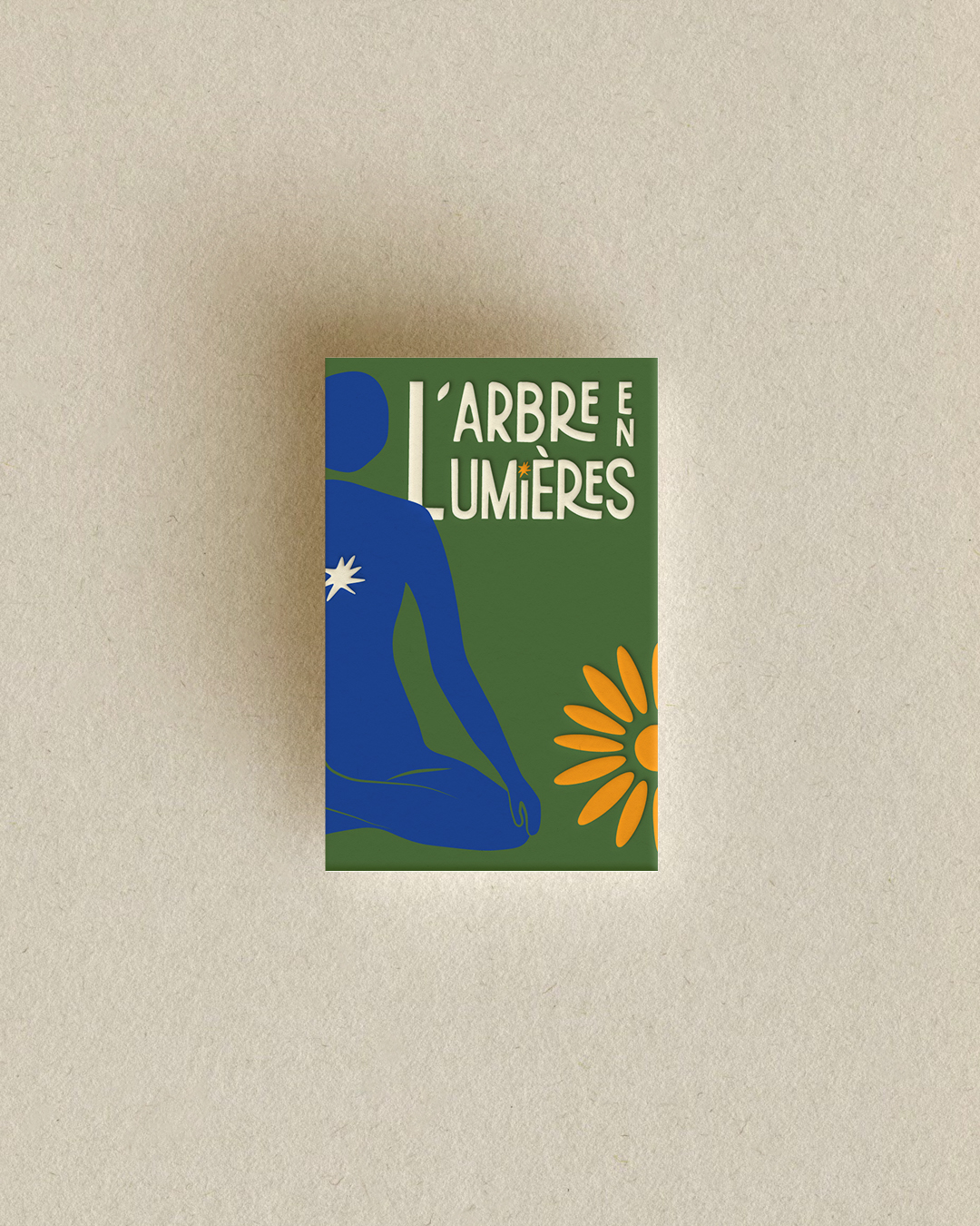
The visual identity was built around the idea of movement and growth. I created a custom wordmark where certain letters are elongated to evoke fluidity and motion. The accents of the typography were redesigned as small leaves, referencing the “tree” in the association’s name.
The emblem depicts a seated figure surrounded by organic forms. At the center of the figure is a star, symbolizing individuality and the inner guiding light each of us carries.
Together, these elements create a brand that feels both peaceful and vibrant, reflecting the association’s mission to support people in rediscovering themselves through movement.