SCHEDULE A FREE CALL TO TALK ABOUT YOUR PROJECT

Épicerie Botanique

Épicerie Botanique is a concept brand exploring a modern take on artisanal food. Blending nostalgic textures with botanical elements, it creates a warm and intentional world.

The BRIEF

Épicerie Botanique is imagined as a curated grocery space where food is treated with the same care as plants in a garden. The brand sits between rustic and elevated, between everyday simplicity and quiet beauty.

The identity extends across:

✺ Product packaging (jam label)

✺ Illustration system (botanical vegetables)

✺ Brand mark and emblem

✺ Editorial-style imagery and spatial direction

The result is a cohesive visual language that feels artisanal, soft, and intentional.

Colors

The color palette blends warm, earthy tones with soft, airy hues to create a sense of balance between grounding and lightness. The combination of brown, terracotta, and cream evokes natural ingredients and craftsmanship, while the muted blue introduces a subtle freshness that keeps the identity feeling modern and approachable.

The challenge

Create a brand that: Avoids clichés of organic branding (overused greens, overly “eco” aesthetics). Feels artisanal without becoming overly rustic or outdated. Balances playfulness with credibility. Translates across packaging, illustration, and space. The real challenge here was restraint, keeping it simple, while still emotionally rich.

Design approach

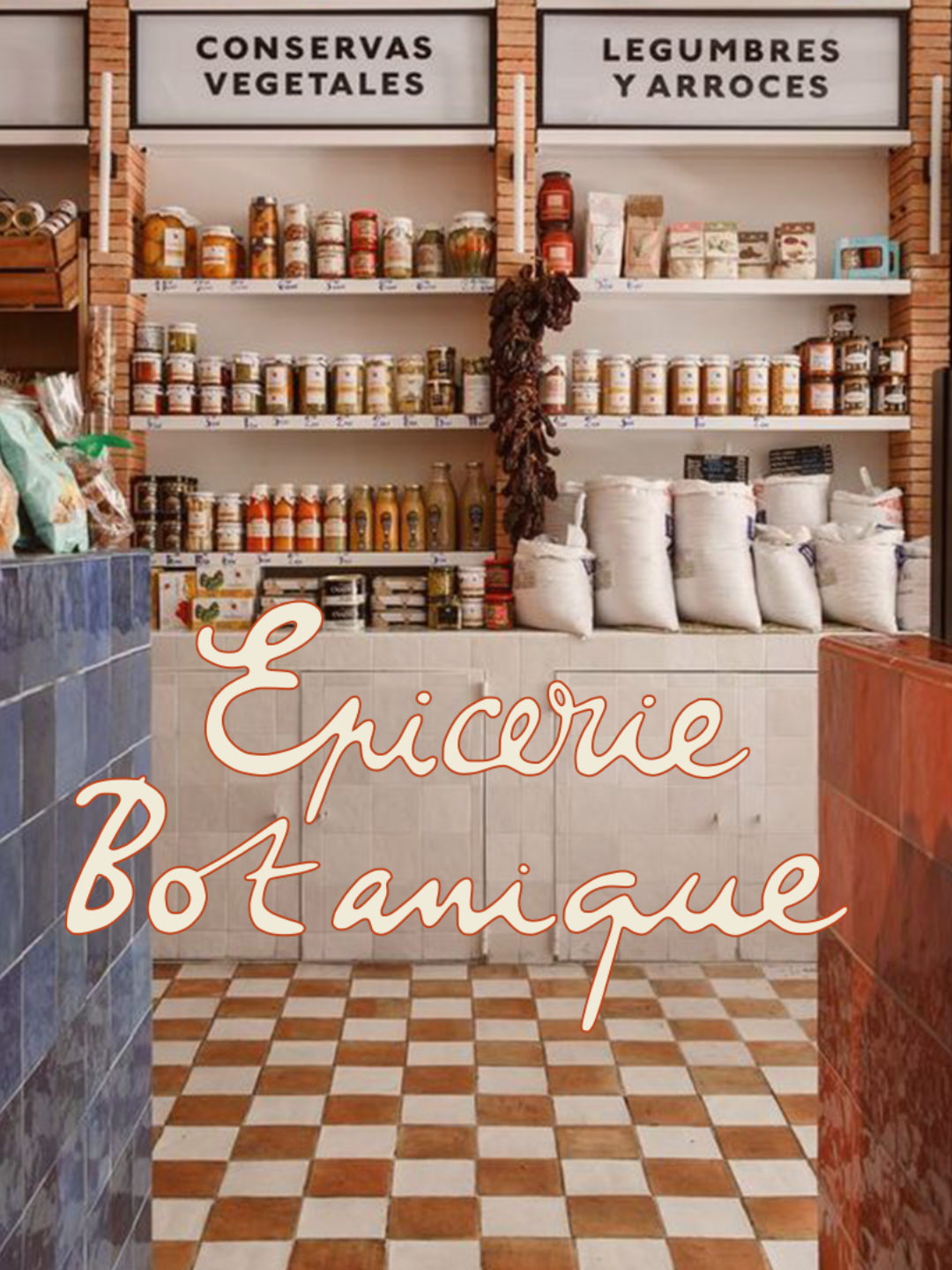
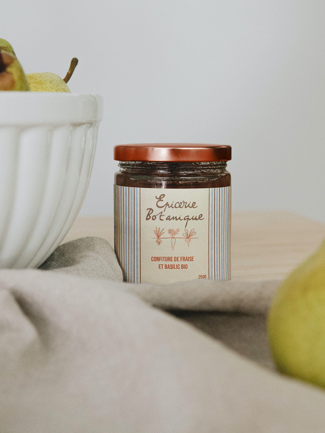
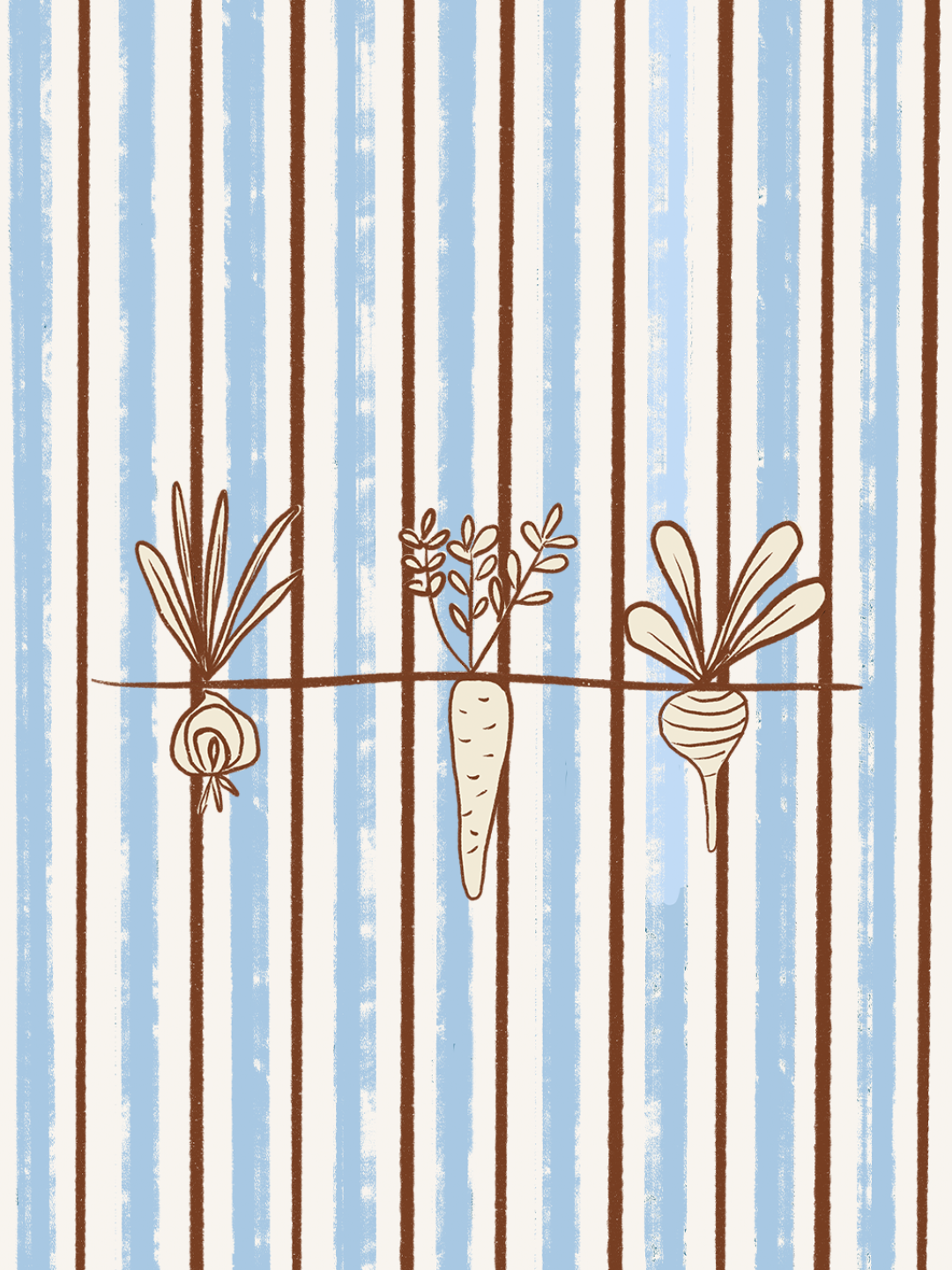
The direction leans into emotional familiarity rather than trend-driven design, drawing from the quiet nostalgia of traditional grocery stores and everyday rituals. Striped patterns reference vintage packaging and textiles, grounding the identity in something recognizable and comforting, while hand-drawn botanical illustrations introduce a sense of life, imperfection, and care.

The palette and overall visual treatment favor softness over contrast, with sun-faded tones that create a calm, almost tactile atmosphere. This is balanced by a subtle sense of playfulness in the logo and emblem, where organic shapes bring lightness to the more structured elements of the identity.

Art direction extends this world through natural textures, linen, wood, and fresh produce, shaping a sensory experience rather than a purely visual one. The result is a brand that feels warm, intentional, and quietly alive, where food is not just presented, but felt.

No items found.
See what else is blooming
View next project →