
A calm, tactile brand identity inspired by the raw beauty of clay and the quiet imperfection of handmade objects.
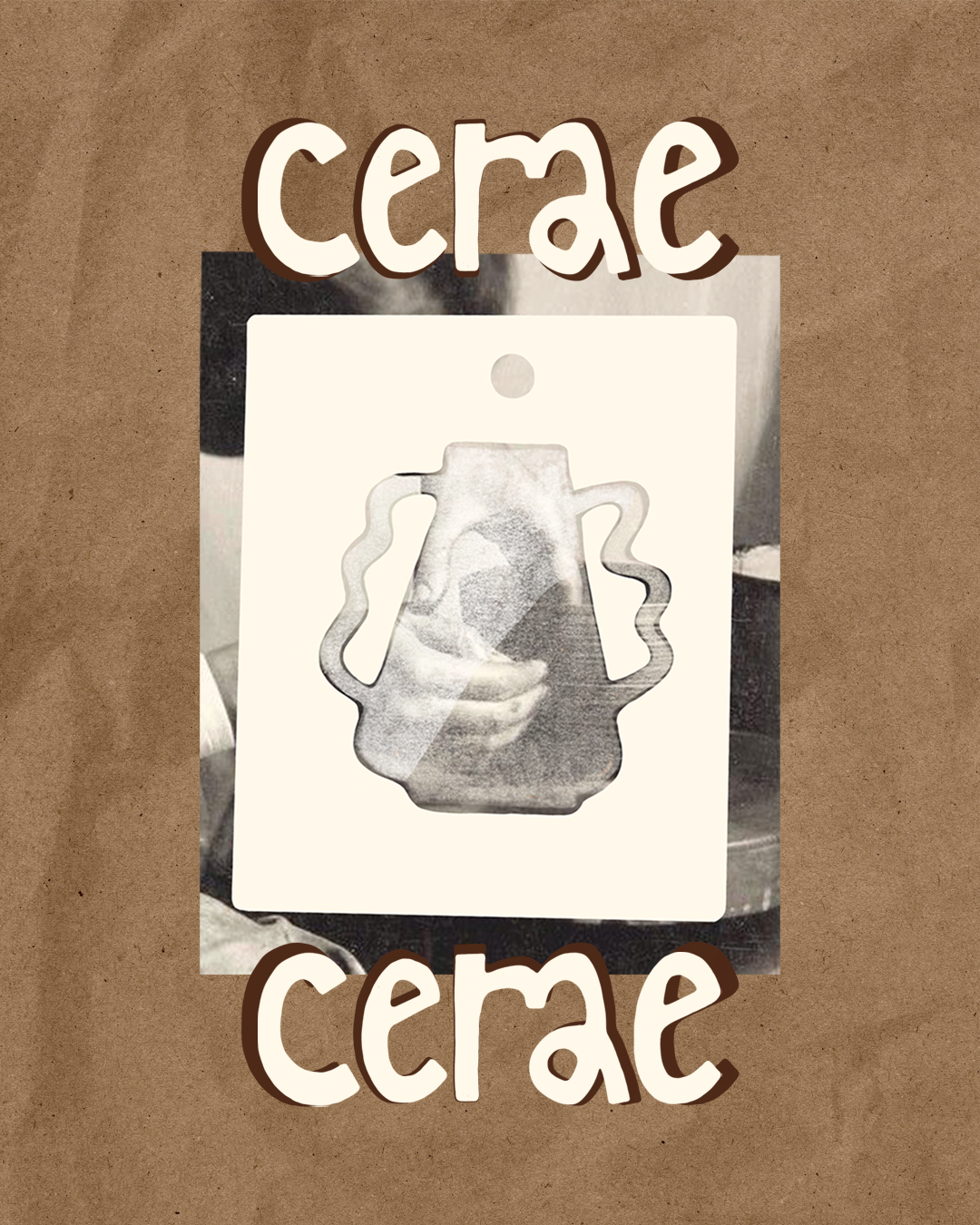
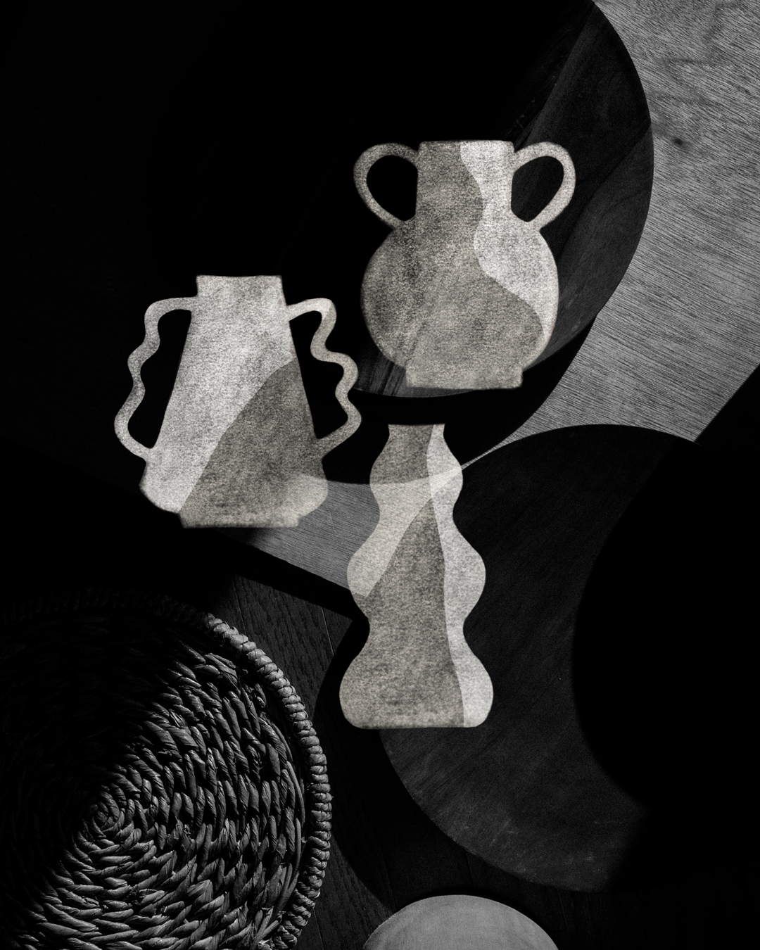
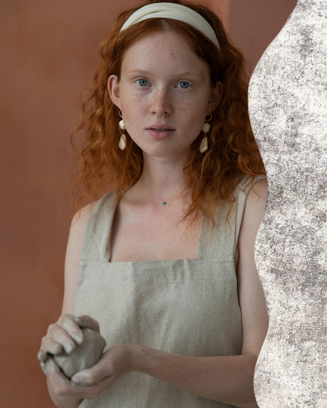
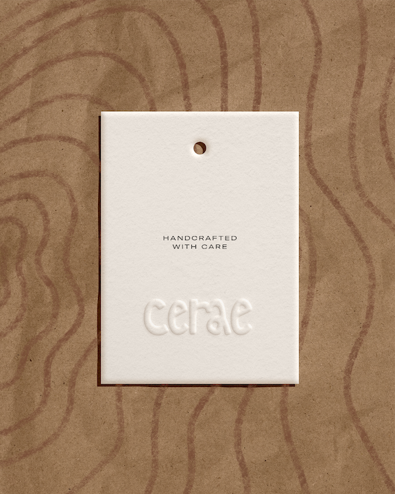
The direction centered around natural tones, soft curves, and subtle irregularities inspired by the material itself. The visual language draws from the raw texture of clay, balanced with clean typography to create a sense of quiet sophistication. Shapes were kept fluid and imperfect, echoing the handmade process, while the overall composition remains intentional and structured. The result is a brand that feels grounded, sensory, and deeply connected to the act of making.
